The Enemy of the State
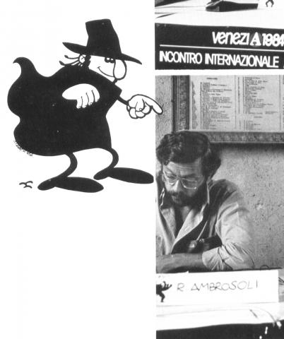
by Roberto Ambrosoli
The Anarchik is perhaps the first attempt to give anarchist propaganda a less self-important and serious tone from its “classical period,” at least from the post-war time onward.
The mother of the Anarchik is certain. Anarchy. His father, less so.
In addition to his official parent, the author of this article and his illustrator, my dear, brotherly companion Amedeo Bertolo, and many other frequenters of my house and life have to be taken into account, too. With a fair amount of irreverence to the mother, one could quip that the Anarchik was conceived in a situation of free love.
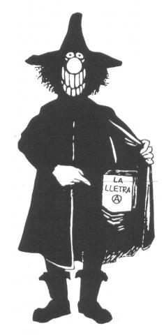
This is his story, based largely on memory and little on documents, so some of the details will be a little uncertain. For the aforementioned reasons, as as well as for the sake of privacy, Anarchik’s exact date of conception remains a mystery, but it can be placed more or less, at the time of the brochure Who Are the Anarchists produced in 1966 by the Gioventu Libertaria Group of Milan. Here he appeared to accompany the text of the pamphlet with all the features that defined his character: a wide-brimmed hat and large cloak, all as uniformly black as his ambiguous outfit underneath.
The style of drawing derived itself from comics, cartoonish and bare in line, high contrast, a little “American” even, but still natural and flowing in the draping of the cloak, the wrinkled trouser, and the shoes stretched by oversized feet.
The approach was caricatural, a parody of the anarchist stereotype of the reactionary boor: under the hat a large nose protrudes and a badly groomed beard bursts from his face as he looks at the reader with a knowing smile, extracting from his partially opened cloak the anarchist stereotype’s favored typical gadget, the bomb. This is a “classic” and old-fashioned spherical bomb, black of course, complete with an already burning fuse and its accompanying wisp of smoke conveying imminent danger.
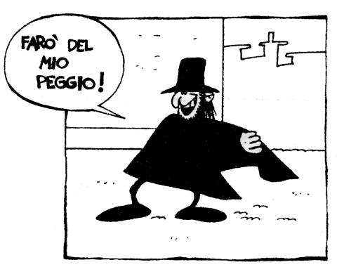
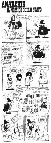
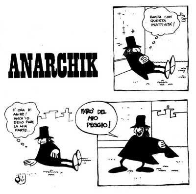
This antecedent to the Anarchik developed for about a year, certain in design but with his personal identity still somewhat unknown. His first official public appearance, identifiable by both name and finalized design, is seen in the first and only issue of the publication Il Nemico dello Stato (The Enemy of the State) in 1967 in a four-panel design. After a rapid-fire assessment of the moment in which he found himself and the need for anarchist intervention, he ends with the declaration, “I will do my worst!” This Anarchik is the same as his antecedent from Who are the Anarchists (hat, cloak, big nose, scraggly beard), but he’s been simplified into a more cartoon-style character wearing tight black leggings which, together with the final K in his name, provide an ironic allusion to certain popular villains (Diabolik, Satanik...) in comics at the time.
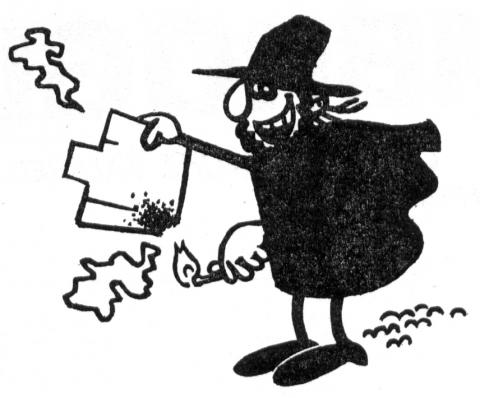
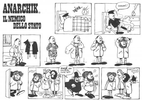
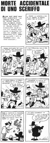
In contrast to these, the Anarchik has a derisive and chattering attitude, highlighted by the toothy grin plastered across his face replacing his original, suggestive smile, a sure sign that he has evolved not just morphologically but psychologically as well. After his debut in The Enemy of the State, he lived a precarious life in ‘68 and ‘69 through fliers, pamphlets, and screen- printed posters, landing in 1971 on the pages of A-Rivista Anarchica. There he had a relatively stable presence and served his illustrator’s intention to provide a “libertarian humor.” The layout evolved, growing from the single strip to the nine-panel model (three rows of three) and the stories became more dynamic with the appearance of one of his many “antagonist-victims.” such as the priest, both decadent and a little pathetic, who flees with his cassock raised from the threat of the Anarchik’s bomb, which always hits its mark and explodes, but only with modest and reversible effects, allowing the scene to play out periodically.
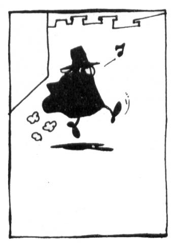
Anarchik’s bomb is a symbolic and humanitarian bomb that provides its illustrator (and hopefully the reader) with the pleasure of representing the smoked and burnt priest, his lace underwear protruding from a tattered tunic, while the little man in black runs away emitting his ramshackle cackle (Hee! Hee! Hee!) The carefree period of the comic ended soon.
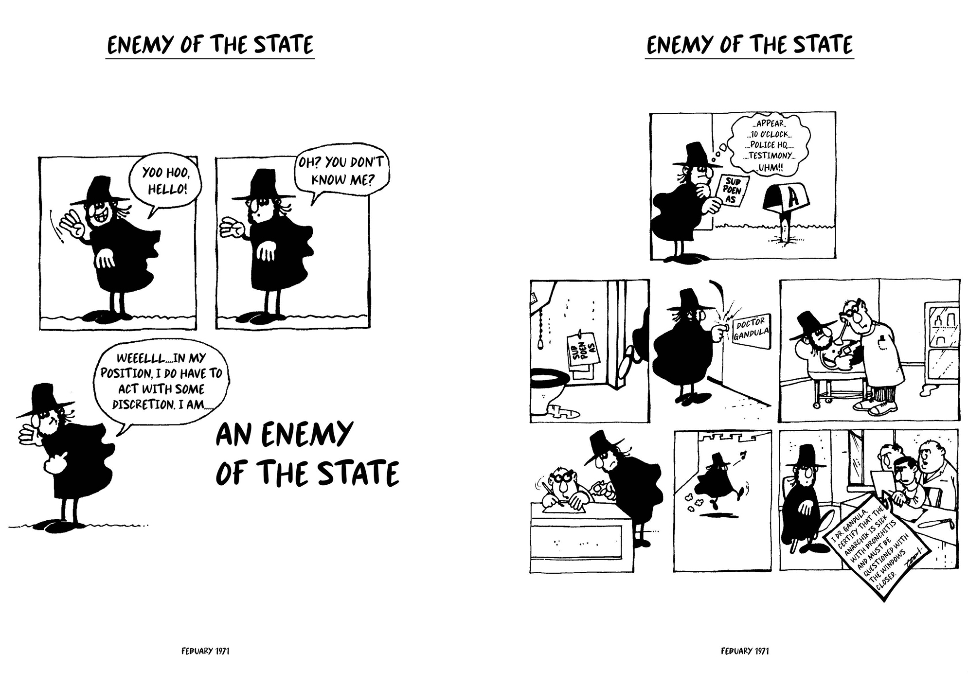
May 1968. The State’s massacres and everything that followed required a more conscious attitude, and ours dedicated itself to commenting on what we found to be important and underlying in the current and unfolding events. The Anarchik wakes from a nightmare in which some of the revolutionary leaders reveal their true authoritarian intentions (an allusion to certain Marxist-Leninist strains of the students’ and workers’ struggles), or he presents himself for police interrogation with a medical note citing a diagnosis which necessitates the windows being shut (an allusion to Pinelli’s flight from the window of the Milan Police Station).
This was the most intense period of the Anarchik’s life, during which the increased political tensions determined his spherical bomb’s disappearance, or seeming disappearance, if you prefer, while he waited for better times. At a time marked by the recurring presence of other bombs, non-anarchist and absolutely non-humanitarian, the use of such an instrument for humorous and recreational purpose felt inappropriate. Instead, the presence of the little man in black outside of comic strips increased as he accompanied the text of articles, leaflets, and posters, becoming a sort of logo of the militant milieu frequented by his, more or less, official parents, and replaced, occasionally, by other tendencies within the anarchist movement, even outside of Italy.
As a consequence, some “fakes” also appeared which his illustrator likes to meticulously point out, in private, the differences from the original, while benevolently recognizing the good intentions (graphic and political) of the bootleggers.
As time passed, Anarchik abandoned his “active” life and transformed into a symbol (they say it happens to all heroes), which was also due (let’s just recognize it) to the decline in the creative inspiration of his parents who were distracted and overwhelmed by other tasks, changing times, and personal events.
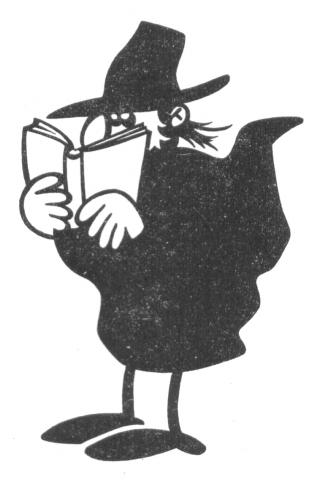
The designer, above all, felt his hand starting to slack and his production decrease, which increasingly limited his range of expression with the Anarchik. The Anarchik increasingly became drawn in two styles, for aesthetic rather than ideological reasons, the first with his cloak open and fluttering backward and the second muffled, his cloak fluttering but enveloping his person.
In the first case, his iconic smile is still visible, and his hands are free to hold objects so that the image can be adapted to different situations in which the presenter still wants to convey some sympathetic identification. The second, the face is partially covered and grimmer, used generally to express hostility to potential enemies.
These are now the “classic” images of the Anarchik, the ones that have challenged the adversaries of our era and the enemies of anarchism, transmitting an implicit, vague, but unequivocal message of libertarian subversion to this day.
These images are saved thanks to the work of those who, unlike this foolish designer, knew how to preserve them.
RESOURCES


